During a scientific investigation, observations and measurements are made and measurements are usually recorded in a table. Graphs can be used to organise the data to identify patterns, which help answer the research question and communicate findings from the investigation.
Once you have decided to construct a graph, two decisions need to be made:
- What type of graph? and
- Which variable goes on each axis of the graph?
Picture graph
Picture graphs support students in the transition from using physical representations to representing information using symbols or pictures in columns. The symbols or pictures must be the same size.
Table A shows the results recorded for an investigation of the types of small animals found in different environments. This information is represented in Graph A by using one small picture for each animal in Table A.
Table A: Number of small animals near the play equipment
| Types of small animals | Number of small animals |
| ant | 5 |
| worm | 3 |
| snail | 2 |
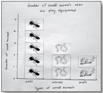
Graph A:
Number of small animals near the play equipment
In the graph, each picture might also represent a number of animals, for example, 1 picture = 5 animals found.
Analysis
Analysis of Graph A shows that different numbers of small animals were found near the play equipment. Students could compare graphs of different environments to determine which environments suit which animals. For example, if lots of ants were found in the garden, near the play equipment and in the lunch area, students might conclude that ants can live in lots of places in the schoolyard. If ants were only found in the garden, students might conclude that the ants prefer a garden habitat because they aren’t found in other places.
Column graph
Where data for one of the variables are in categories (that is, we use words to describe it, for example, earthquake location) a column graph is used. Graph B below shows how the results of an investigation of the effect of material type on the amount of light that passes through it (data in categories) have been constructed as a column graph.
Table B: The effect of material on the amount of light that passes through
| Material | Amount of light |
| plastic sheet | all |
| bubble wrap | almost all |
| tissue paper | most |
| paper | not much |
| cardboard | none |
| foil | none |
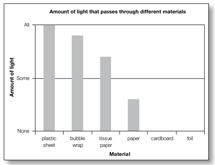
Graph B:
The effect of material on the amount of light that passes through
Analysis
Analysis of Graph B shows that the amount of light that passes through materials changes according to the type of material. This is because the more transparent or translucent the material is, the more light can pass through it.
Which variable goes on each axis?
It is conventional in science to plot the variable that has been changed on the horizontal axis (X axis) and the variable that has been measured/observed on the vertical axis (Y axis) of the graph.
Graph titles and labels
Graphs have titles and each variable is labelled on the graph axes, including the units of measurement. The title of the graph is usually in the form of ‘The effect of one variable (the thing we are changing/ independent variable) on the other variable (the thing we are measuring or observing/dependent variable)’. For example, ‘The effect of material on the amount of light that passes through.’
Steps in analysing and interpreting data
Analysing and interpreting data is a fundamental part of the scientific process and helps students draw conclusions from the data they have collected. See samples of analysis underneath both Graphs A and B above.
Step 1 — Organise the data (for example, construct a graph) so you can see the pattern in data or the relationship between data for the variables (things that we change, measure/observe or keep the same).
Step 2 — Identify and describe the pattern or relationship in the data.
Step 3 — Explain the pattern or relationship using science concepts. Questioning for analysis Teachers use effective questioning to assist students to develop skills in interrogating and analysing data represented in graphs.
Questioning for analysis
Teachers use effective questioning to assist students to develop skills in interrogating and analysing data represented in graphs.
For example:
- What is the story of your graph?
- Does the data in your graph reveal any patterns?
- Is this what you expected? Why?
- Can you explain the pattern?
- Why did this happen?
- What do you think the pattern would be if you continued the line of the graph?
- How certain are you of your results?

Here's where you'll find:
- Deep dives into high impact teaching practices
- Discussion questions for you to explore with your colleagues
- Links to related lessons in our teaching sequences